I am now a designer
I thoroughly enjoy well-designed software that is easy to use and pleasant to look at. But in my attempts to make beautiful UI in the past, I've always come up short. I can see when something is right, but I don't always know what I need to get there. Is it the spacing, the font, some subtle shadow that is needed? Good design also requires a lot of iteration, at least for me, and that is something I rarely have the time for on my side projects where this is relevant (at work we have an external designer). Same goes for the user experience, where you need to try out several options in practice before you realize what works best.
But these obstacles are now gone due to AI agents.
Bargsteen.com
A natural starting point for me, was to redesign this blog.
Here is the design that I created by hand several years ago:
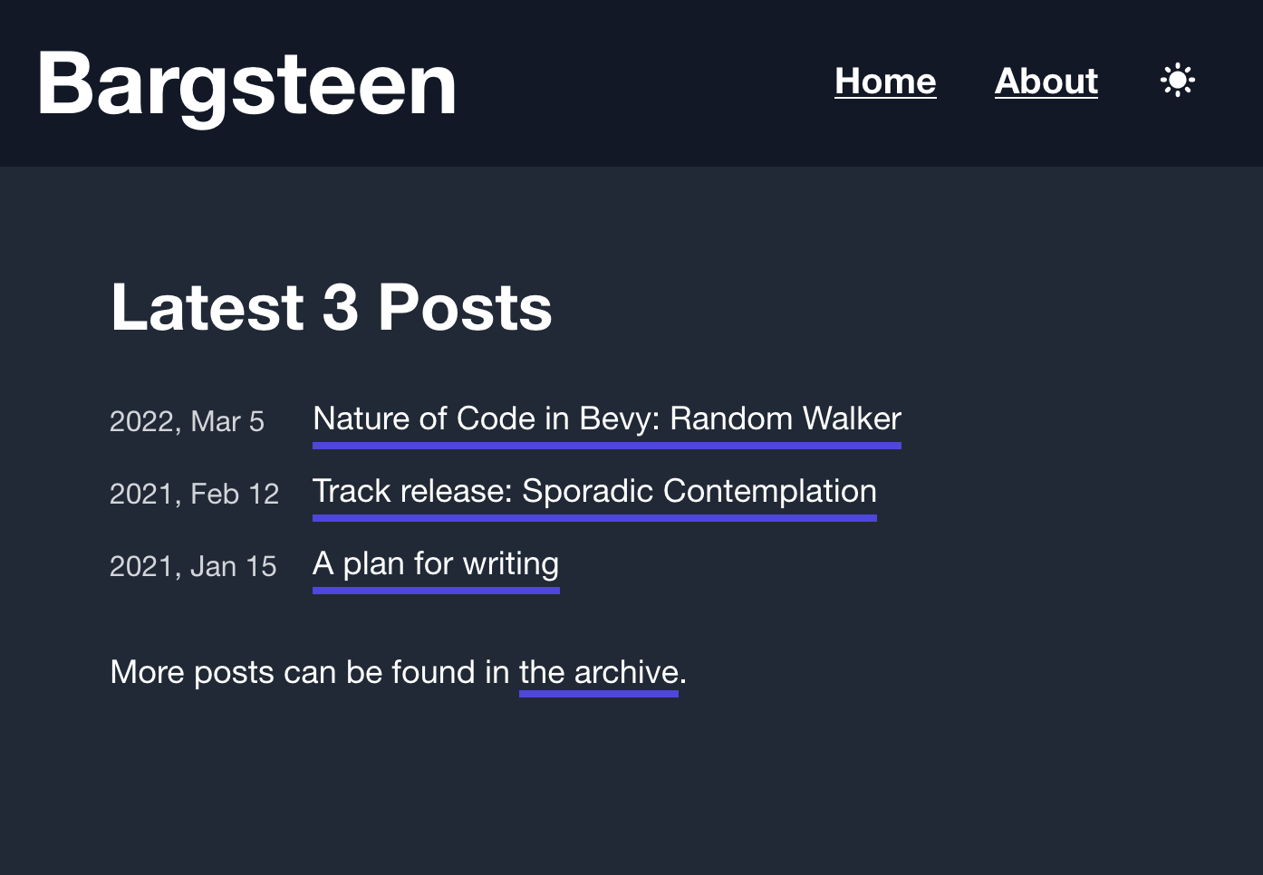
It works but is quite boring and I wanted something more interesting.
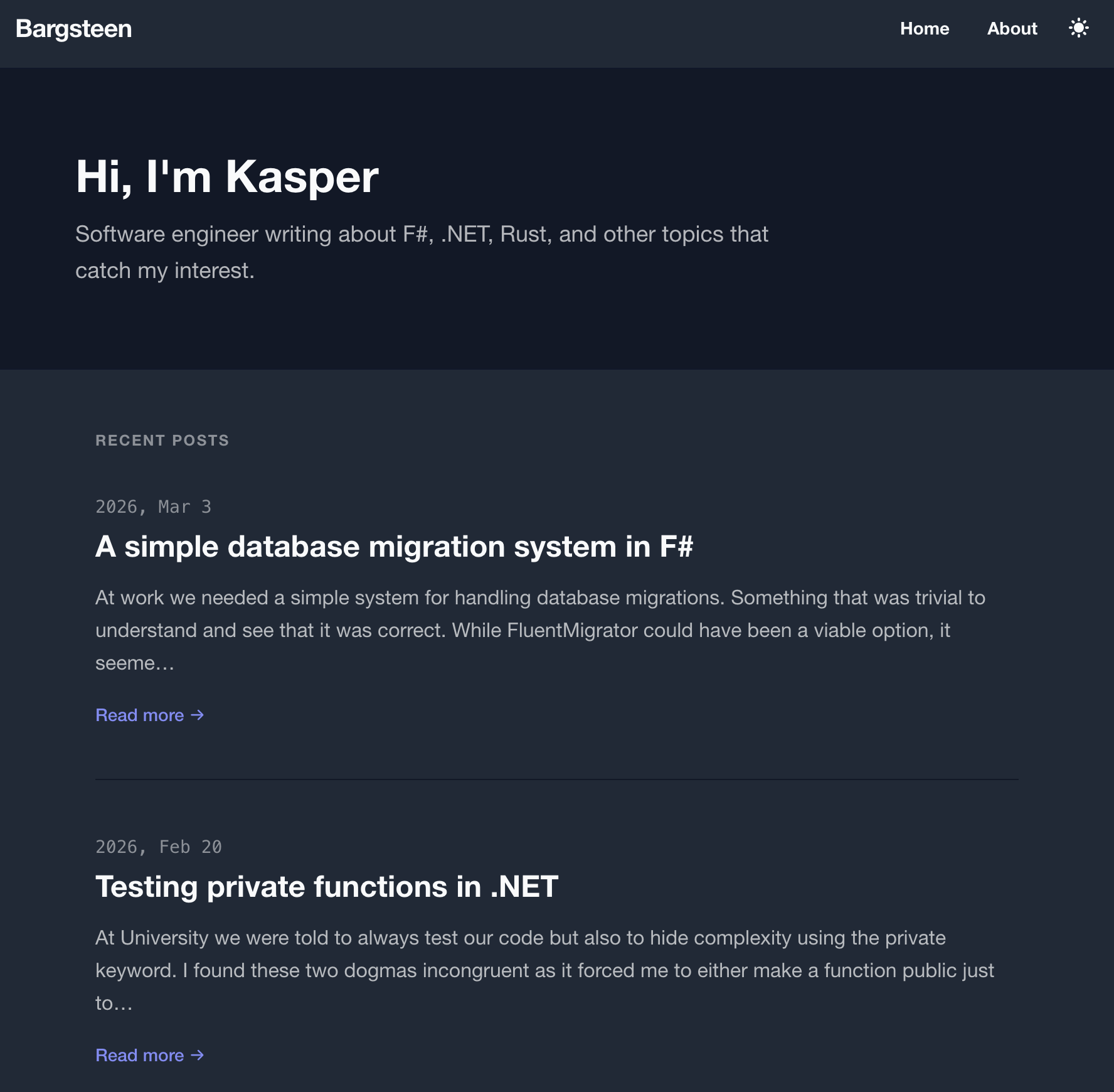
So I asked Claude to improve the design and make it more modern. Here is what it came up with. It is an improvement, but I don't think it really stands out.
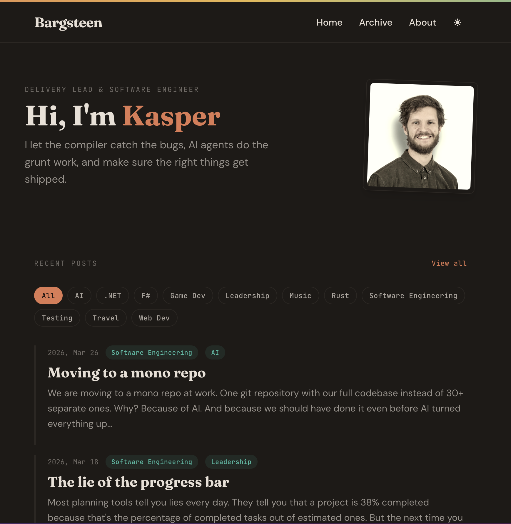
But fair enough, I didn't give it much direction and I also wondered whether there were any good design agent skills that I could use. I found the frontend design skill from Anthropic, gave two reference blogs and got to something much more interesting. I iterated quickly with Claude by giving it screenshots of things I wanted to change and asked for it to try several variations. It was amazing to see how quickly we could whip up something that suits my taste and looks quite professional.
Skaffa - grocery list side project
Thrilled by the possibility of designing beautiful apps, I threw myself into building a better grocery list for our household. When iterating on the design I gave a handful of keywords for the design direction and quickly went through several iterations for each of the pages.
This is the current state of the Skaffa app, which is in production and free to use!
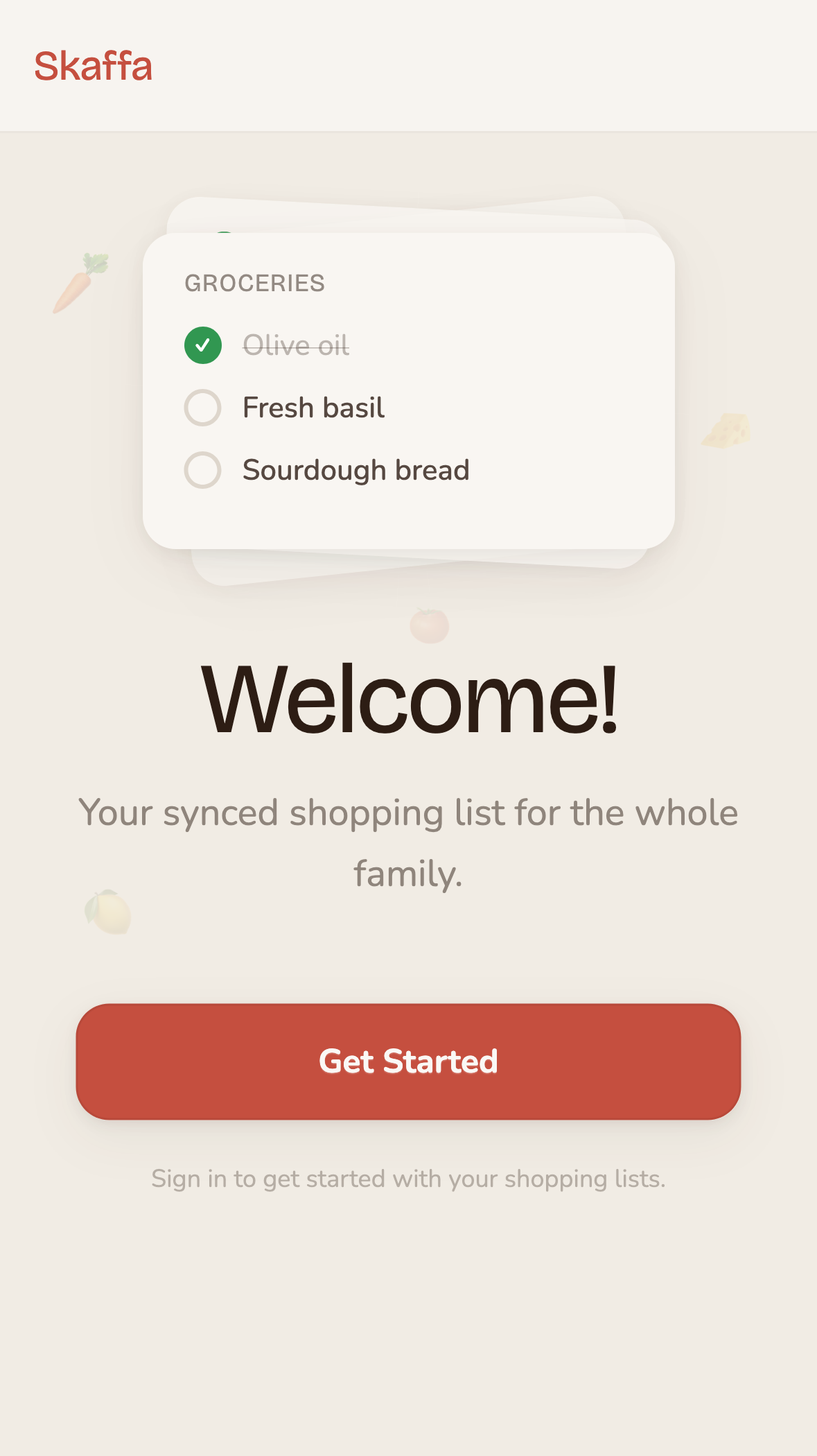
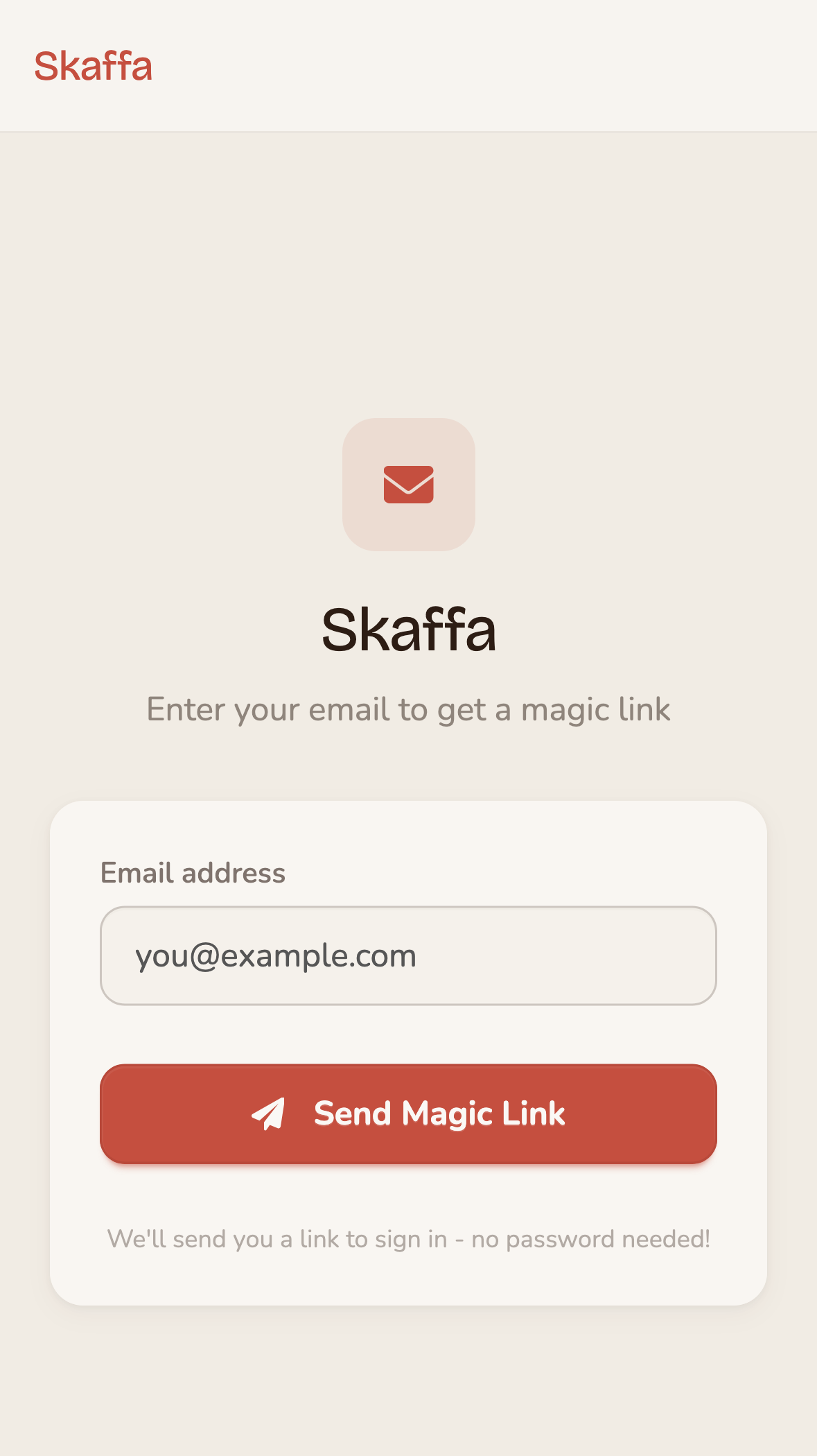
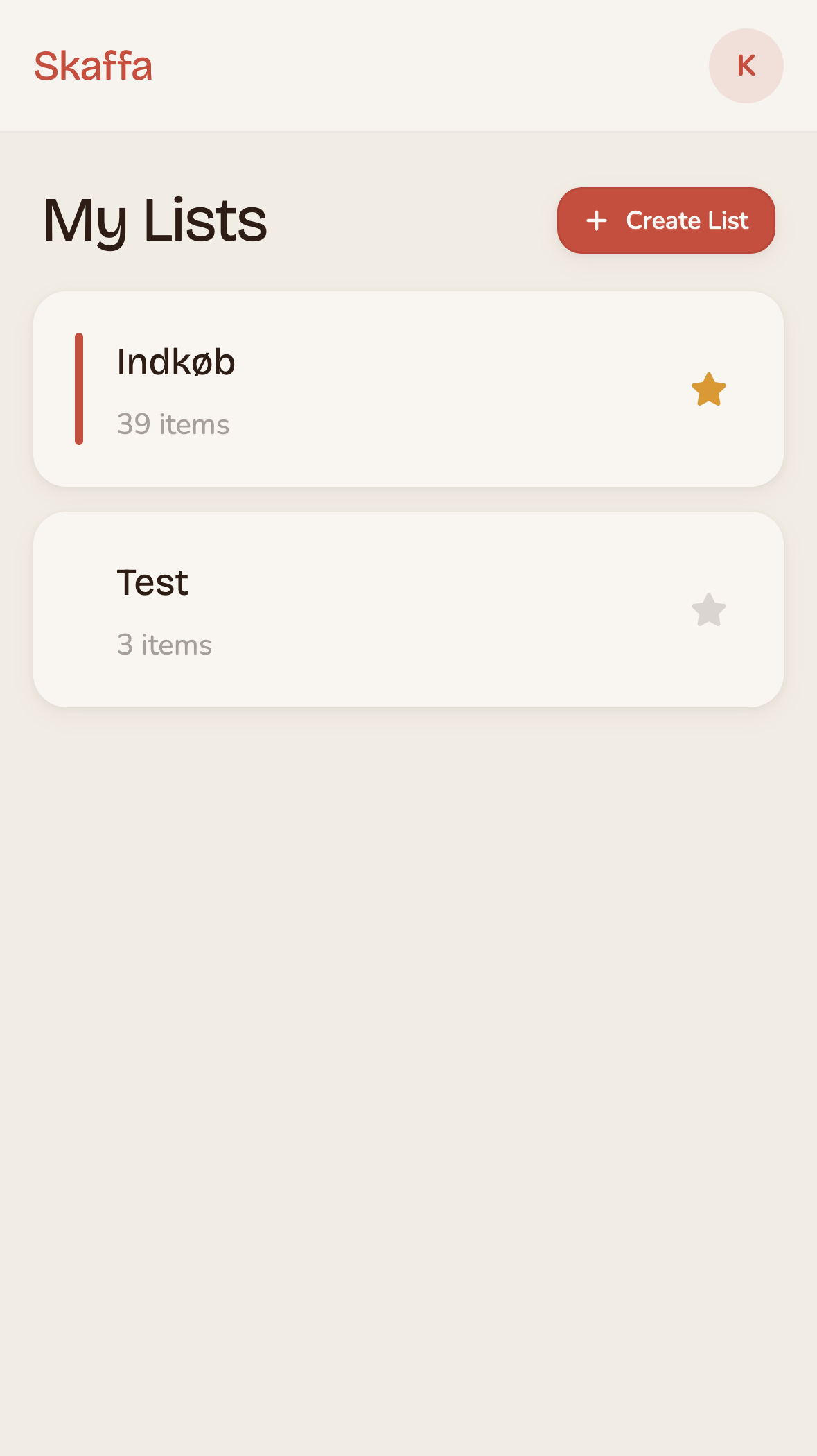
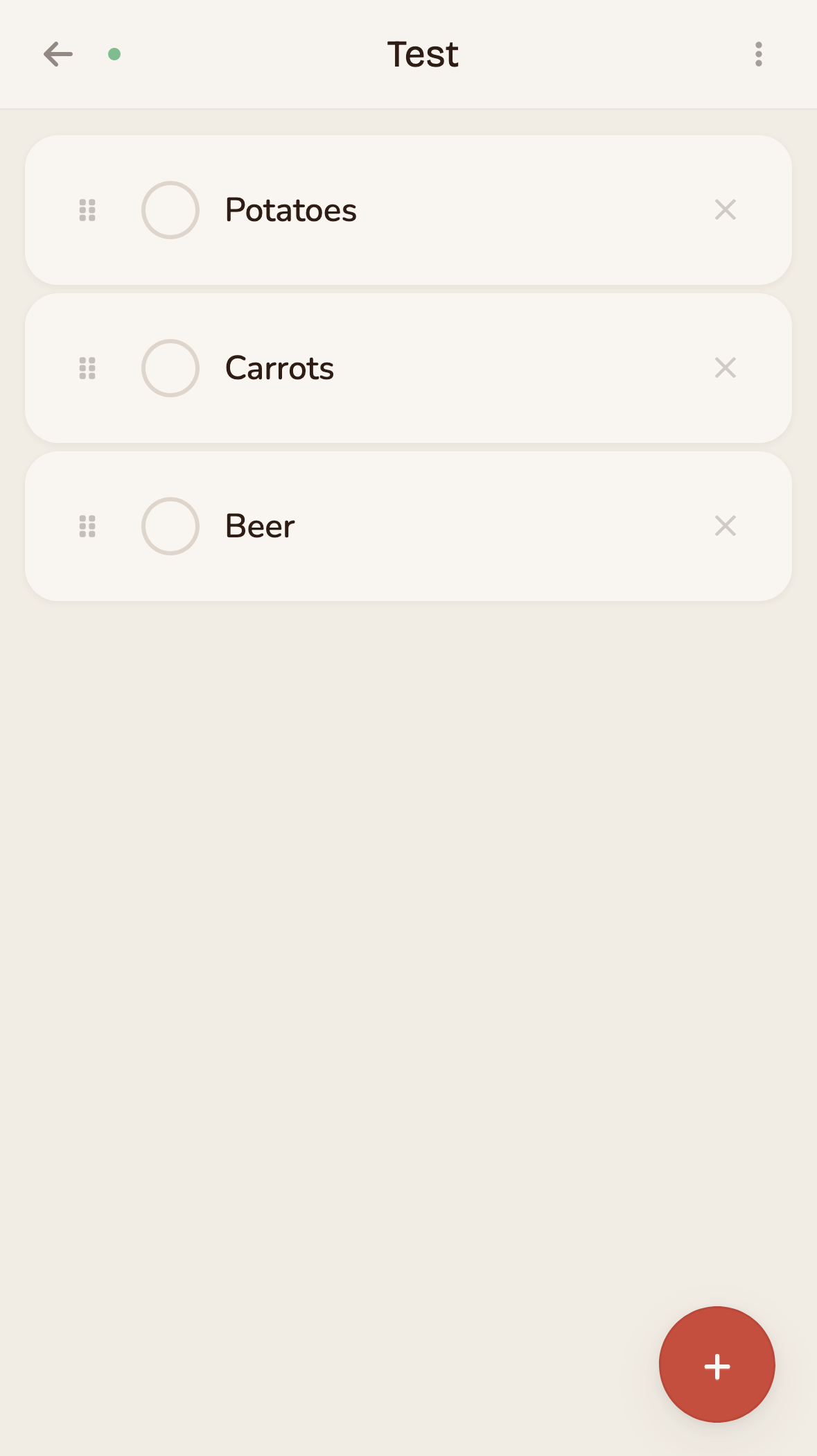
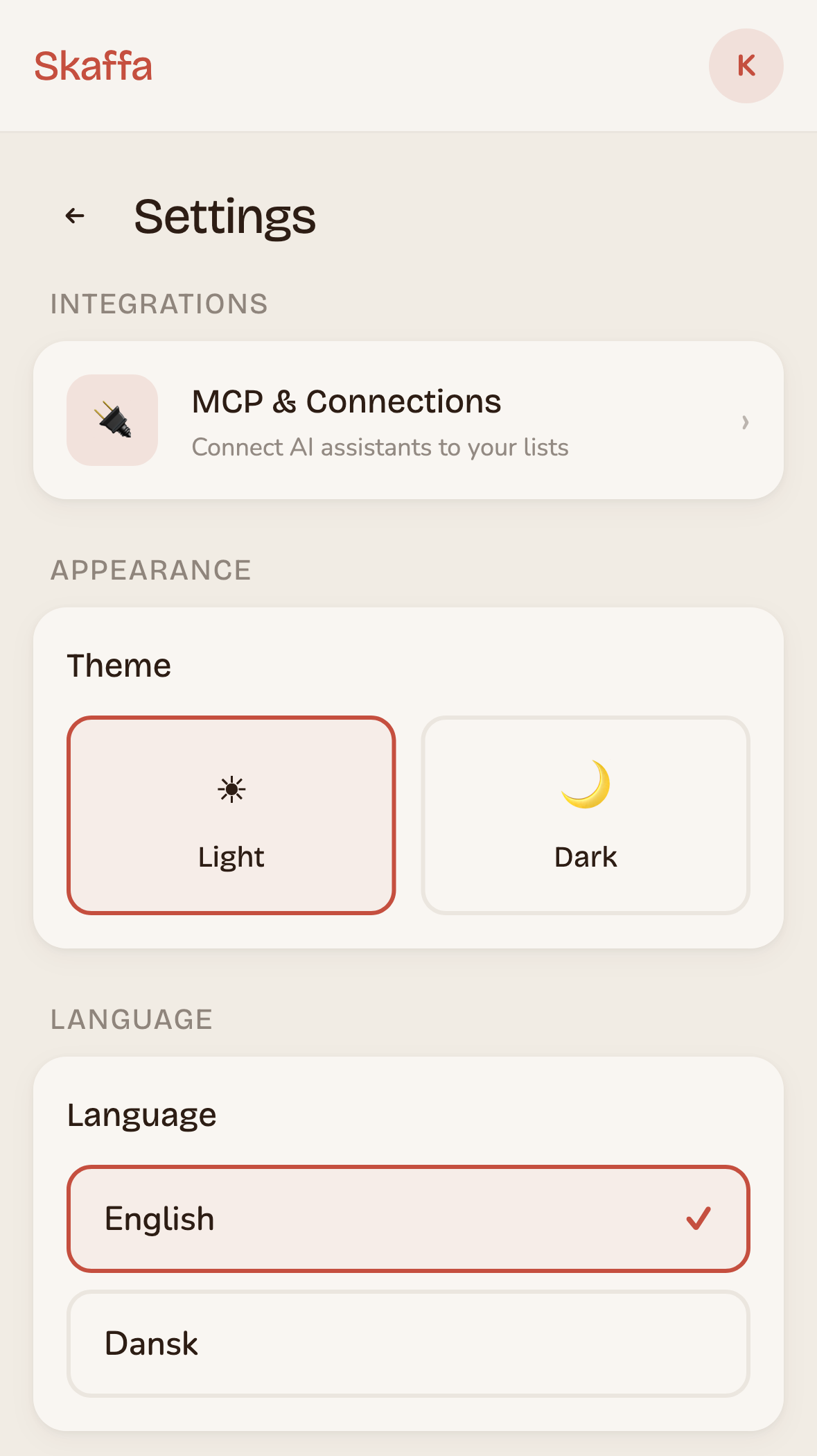
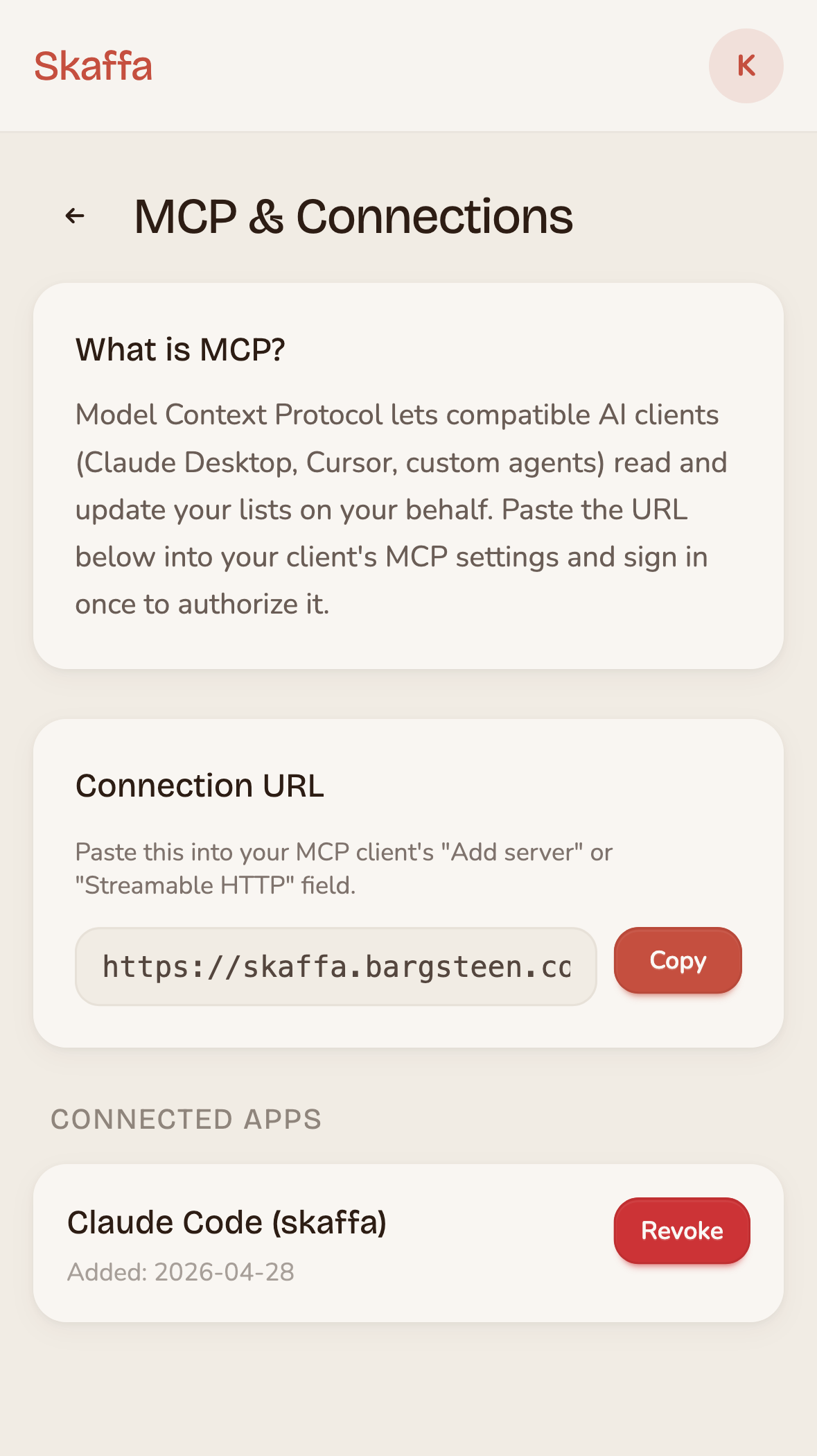
While I am not claiming this app has superior design, it is certainly not bad either. It feels warm and friendly with good spacing, colors and fonts. Not bad for an hour of prompting.
Give me options and think like Steve
One general tip I've found is to get Claude to give me options on both the user experience and design and then ask it to implement several of them including toggles to switch between them. I also found that referring to Steve Krug's great book Don't Make Me Think helps Claude when in doubt about the user experience.
The world is full of software with horrible design and user experience due to a lack of time and skill. Now it no longer has to be like that. We can all be designers. I am now a designer. Go out and build great software!