The lie of the progress bar
Most planning tools tell you lies every day. They tell you that a project is 38% completed because that's the percentage of completed tasks out of estimated ones. But the next time you look, it says 21% complete, because new issues were added. This is extremely annoying but also common. Estimates are guesses, scopes change, and unknown unknowns are the norm. The problem had annoyed me for a long time but became even more clear when I saw Basecamp's the needle and hill charts, which both are set by humans, not metrics.
The needle
Let's start with the needle. It is a simple gauge that you can drag from zero to done and add both text description as well as one of three status indicators "On track", "Some risk", "Concerned". Each update is saved and you can see the full history. You get a lot of value from just reading this history.
- 10% |On track| - "Spiked the difficult parts of the project and made a rough plan"
- ..
- 25% |Some risk| - "Found a potential blocker in how service X is supposed to work together with the new integration"
- 78% |On track| - "Full speed ahead on the last leg of the project"
- 65% |Concerned| - "Found major blocker.."
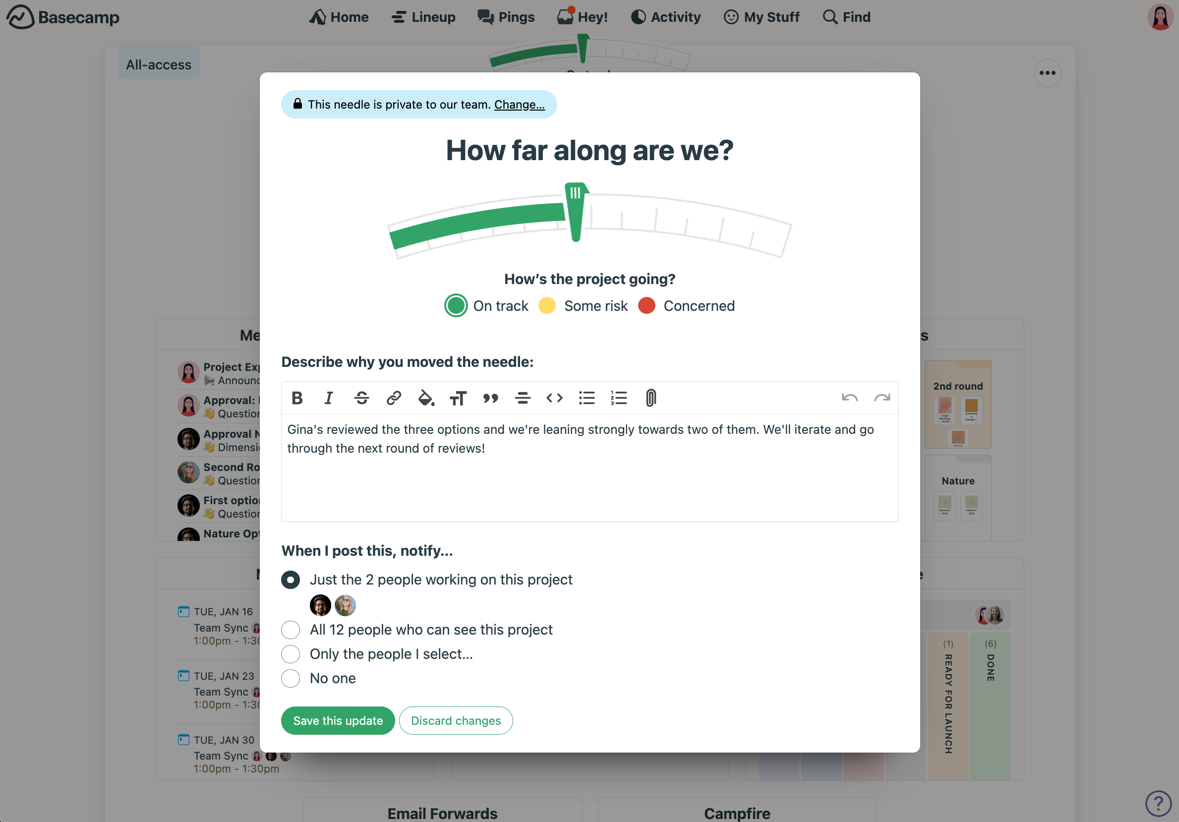
The progress bar can also go back and forth here, but it is not defined by the number of tasks or their estimates, but by human intuition about the project. If you need even more information about a particular project, you can dive into the hill chart of it.
Hill charts
With hill charts you can represent the different end-to-end parts of the project as dots on a chart that looks like a hill. The path up the hill is labelled "Figuring things out" and the path down is "Making things happen".
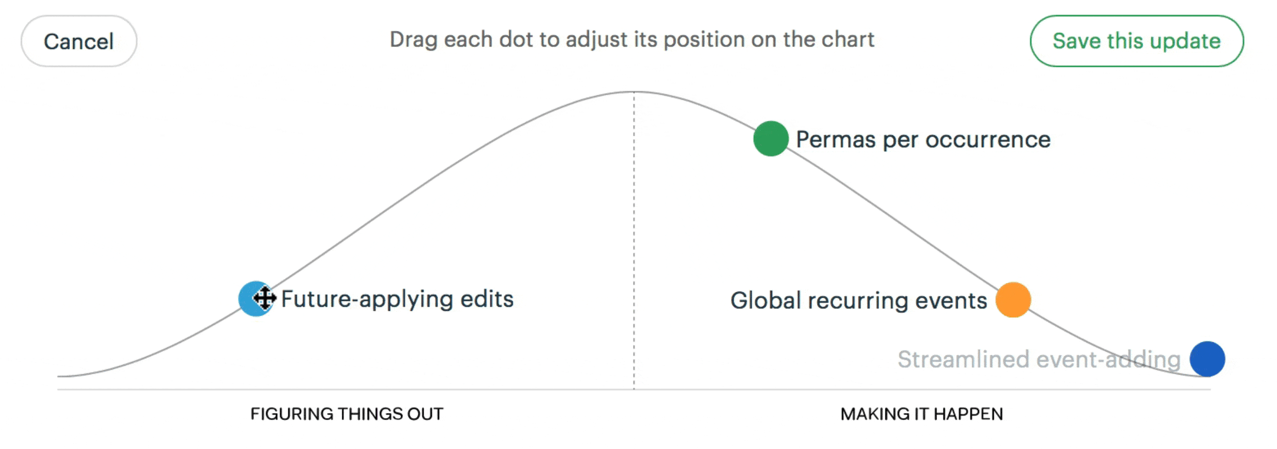
Project members manually drag the dots over the hill and, as with the needle, add an optional text description with each update. You can naturally view the whole history of updates to see how the different parts of a project has progressed. I think it fits well with how the reality works. In the beginning you don't know very much about what e.g. "push notifications" even entails. Perhaps you've never implemented it. Does the API differ on Android and iOS? Which notifications should we even send to hit the right balance between information and spam? When you start working on it, you gain knowledge about it. Reduce the know/unknown unknowns and turn them into knowns. At some point you can see all the way to the finish line. That is when you reach the top of the hill and you hopefully have a good time rolling down the hill. If you hit a large bump, you simply drag it back up the hill, perhaps even back to before the top.
The hill chart also gives you a good insight into whether the project is split into the correct number of sub-projects or goals. If a particular dot is being actively worked on but is stuck at the same location for a week or more, it might indicate that the dot is too large or the scope is unclear. Should it perhaps be broken down into three separate dots which can be implemented end-to-end independently?
Bring these insights into your tools
No matter which tool you use, try to see if you can incorporate human intuition into the progress indicators instead of merely metrics. Perhaps you can draw your own hill chart and add it as screenshots in the project overview? Or make each project lead give a weekly status similar to the needle, with an intuition-based completion percentage, one of the three risk indicators, and a short description.